When setting up a classroom each year, many teachers likely look around the space and consider how it will best serve their students. There are traditional areas of the room that are focused on kids, like the class library or the workspaces (tables or desks). There are other areas that teachers may set up for collaborative work, like a rug or meeting area. It’s likely that there are even spaces on the walls that are devoted to students’ work. In these spaces, students are considered. But how can we make sure that the entire space, from the furniture placement to the very decorations on the walls (or lack thereof!), is truly centered on students’ and their needs? Let’s explore that question!
What does “student-centered” mean?
It’s open to interpretation! My understanding of student-centered design and decor regarding classrooms is based on my own research, ideas, and learning. In that way, it may be different from another educator’s interpretation. In this post, I’ll describe a student-centered space as I understand it to be. Know that my interpretation is not the definitive way to make a classroom space focused on students. Rather, it’s how I have done so over the years after my own learning.
To be “student-centered,” one would assume that a classroom is set up for students. But isn’t that the point of a classroom at its core? Yes, but the execution sometimes begins to lean more on adult comforts and design rather than on the particular age range and development of the children in the space. A student-centered space takes into account the needs of the children it serves, whether they are four year olds coming into traditional educational spaces for the first time or nine year olds who are finding their place in the educational world. With the age of students comes specific developmental considerations that can help educators create a space that supports growth. To learn more about development by age, I highly suggest Yardsticks from Responsive Classroom. I’ve owned a version of this book since I was a student in my undergrad ECE program!
A student-centered space simply looks like a space meant for kids! As the adults, we’ve done research into what children at different phases of development need, but to the observer, a student-centered classroom looks like a place that engages kids, includes them in the process of learning, honors their ideas and creativity, gives them freedom and choice, and is a comfortable place for them to be. So, what exactly does that look like?
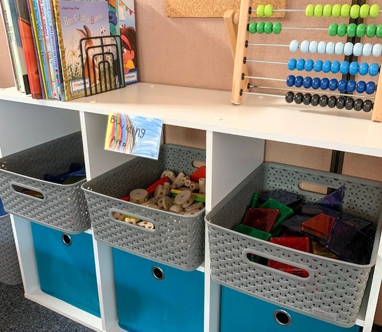
Make the space look and feel inviting for kids
A student-centered classroom looks like a place that kids want to be. How to do that includes a variety of things, but the first and most obvious is to include things in the space that engage kids and make them want to spend more time there. This may mean that there are spaces in the room dedicated to play, creativity, or imagination. It could also look like having materials displayed and at the ready, or it could include spaces that look comfortable to sit and work or read. As adults, we know what kinds of places we like to spend time, and if that place is one where we’ll be doing work, we particularly understand what we do and do not like in those spaces. Consider that from a child’s perspective. What kind of place would spark their creativity or engagement? Does it look like a place where kids would want to be?
Reminder: This doesn’t mean one should turn their classroom into a child’s play place. A classroom is a sacred space meant for learning and growth. Keep the environment respectful of that without making it novel. Consider the age range of your students and the overarching goals of your year with them. What you include in a student-centered space can help children learn in ways that are engaging and enjoyable for them, but it does not need to be a place focused solely on fun.
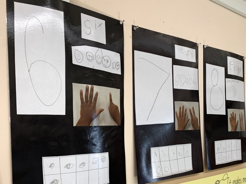
Let student work adorn the walls
I would venture to say that most teachers display work in some way in their classrooms. However, challenge yourself to think about student work in terms of design rather than decor. While bulletin boards with finished work have their place, students can also be involved in the design and creation of materials that they will refer to during their learning. This includes creation of an alphabet or word wall, a number line, a rules/reminders display, expectations for work time, labels for materials, etc. It is quite easy to print or purchase and post, but imagine how a child would feel if they knew their teacher waited for them to help make the classroom space together.
With student-centered spaces, the creation of materials typically includes a discussion or even an instructional mini lesson. When students are involved in the process and their voices are heard, they may be more inclined to utilize the resource they helped make. Charts with instructional content or posters with expectations can be edited or changed throughout the year, and over time, students could even take the lead on creating resources for different learning projects. If this process sounds intriguing but daunting, I understand. I made a set of simple resources that are co-created with the teacher to get you started. It includes detailed lesson plans and talking points!
Challenge your perspective (not so simple)
One of the most difficult shifts, in my opinion, in transforming your classroom into a more student-centered space is when you come to the part when you are forced to question your decisions. In a world that is inundated with ideas, hot takes, influencers, and trends, it can be hard to discern what is worth it and what simply isn’t when it comes to your time and effort as an educator. It may feel strange to do something different than what you see daily on Instagram or from how your team has done it for years. Shifting to a student-centered lens may ask you to challenge your decisions and ask yourself, “Why?”
For example, when I started to go in this direction, I had to take a look around my classroom and think critically about what was in the space, why it was there, and how it best served children. Like many of you, I had a lot of the “teacher things” you’ve seen on social media that go viral right before the beginning of a school year: the 3-tiered cart, the colorful drawer set, various dollar spot or IKEA purchases…different year, different trend. I bought and used these things, so it wasn’t as if they sat collecting dust. But I asked myself, “How does ___ actually help my students learn? Could the space that ___ is taking up be better used for my students? Instead of buying ___ this year, could I wait and let my students help me figure out what to do there?”
It was hard, but I had to really step back from the influence of social media and remember that a student-centered space didn’t depend on viral trends. It depended on the group of children that were in my class each year, their needs and interests, and my ability to respond. It really changed how I approached design as a whole, and it was influenced by my own background in Reggio environments. I had to challenge my perspective on design, and everything changed after that!

Thanks again